Emacs Logo Redesign
The Problem
The Emacs logo has always felt very incomplete, it has always looked like a bunch of blue scribbles to me. Even looking at the aquamacs logo it appears that it is a horse kind of scribbled on a purple background. Almost as if someone started drawing the logo, drew some scribbles, and then decided on wrapping it in an early 2000s web gradient.
The Interim Solution
I originally started by taking icons from different text editors and trying to copy them onto the Emacs app launcher. This worked okay, but I would often confuse myself about which app I was trying to open. I needed to find an icon that was uniquely Emacs specific, with a pleasing aesthetic. To that end I decided to use an inverted version of the Lisp user's group logo which can be found on Xah Lee's blog ergoemacs (http://ergoemacs.org/emacs/lisp_logo.html).
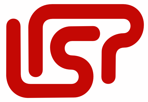
This was a great logo, and it worked for quite some time for me, but I started to think that it wasn't quite Emacsy enough, I needed something that was very Emacs specific, I needed an Elisp logo. Using the same 70s era rounded text aesthetic, I crafted a version that included an E.

Though a little bit crude, and with artifacts of red throughout, it worked pretty well and it confirmed for me visually that this concept was possible, I decided to tweak it a little bit. What if I inverted the E to emphasize that it was an Elisp logo?

To be honest, I don't like it very much, but it was an intersting idea. Moving along, I treated the Elisp logo to the original treatment I made for the Lisp logo to make it match with my computer's icon theme, I changed it to all white.

I think this design looks best and it is what I'll probably end up using for my Emacs logo on my machine.
Finally, just for fun, a traditional Emacs purple verison:

Thank you for reading, I hope you enjoyed.